Discover how a new interactive tool blends official government data with AI to create a dynamic, customizable map of salaries, education, and the future of work.
- A New Way to See Data: The US Job Market Visualizer transforms dense Bureau of Labor Statistics (BLS) data covering 342 occupations into an intuitive, interactive treemap where you can explore employment size, median pay, and growth projections at a glance.
- LLM-Powered Custom Insights: Beyond standard metrics, the tool uses an innovative Large Language Model (LLM) pipeline to score and color-code jobs based on custom criteria, such as a profession’s exposure to artificial intelligence.
- Accessible to Everyone: You do not need to be a programmer to explore the findings; the project packages its massive dataset into a single file designed for you to upload directly into your favorite AI chatbot for deep, data-grounded conversations.
The American job market is a vast, complex ecosystem that is notoriously difficult to comprehend just by staring at spreadsheets. Whether you are an economist tracking macro trends, a student deciding on a college major, or simply a curious observer of the modern workforce, making sense of the data is a daunting task. Enter the US Job Market Visualizer (live demo available at karpathy.ai/jobs)—a fascinating research and development tool designed to let you explore Bureau of Labor Statistics (BLS) Occupational Outlook Handbook data visually. While it is not a formal economic report or academic paper, it serves as a powerful lens through which we can view the shifting landscape of American employment.
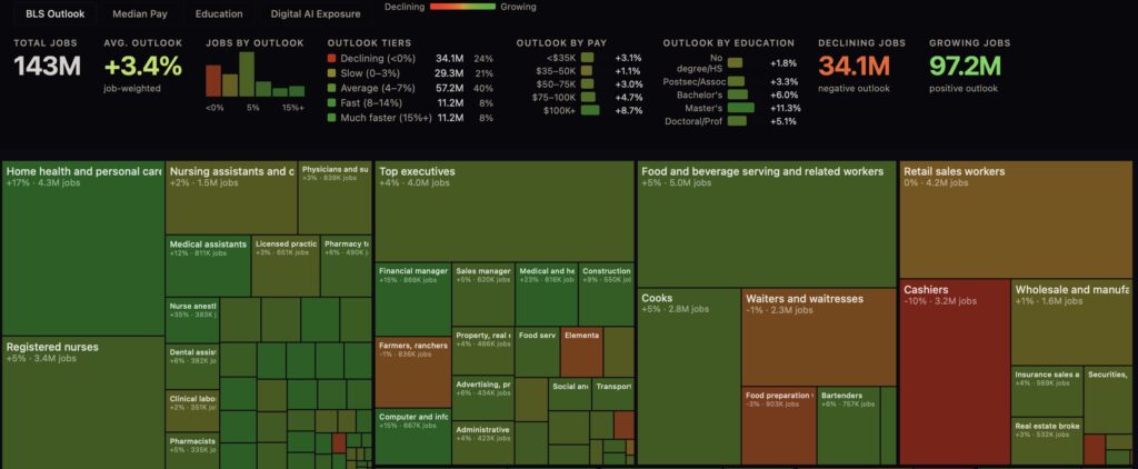
At the core of this visualizer is a comprehensive dataset scraped directly from the BLS. It encompasses 342 distinct occupations that span every sector of the US economy. The tool captures detailed information on job duties, work environments, educational requirements, median pay, and projected employment growth. Rather than presenting this in endless rows and columns, the visualizer builds an interactive treemap. The logic is brilliantly simple: the area of each rectangle represents the total number of people employed in that job, while the color of the rectangle shifts based on the metric you choose to toggle—be it education requirements, salary, or BLS projected growth outlook.
What truly sets this tool apart, however, is its LLM-powered coloring pipeline. The project’s repository includes scrapers, parsers, and a specialized script (score.py) that allows users to write custom prompts for an LLM (such as Gemini Flash via OpenRouter). The AI then scores each of the 342 occupations based on your specific criteria, and the treemap updates its colors accordingly. The default “Digital AI Exposure” layer is a perfect example of this. It estimates how much current, primarily digital AI will reshape each profession. But the true power lies in its flexibility from a broader perspective: a user could easily write a new prompt to visualize a job’s exposure to humanoid robotics, its offshoring risk, or even its vulnerability to climate change impacts.

When exploring the “AI Exposure” metric, it is vital to understand what the data is not saying. A high AI exposure score does not serve as a grim prediction that a job will simply disappear. For instance, Software Developers score a massive 9 out of 10 for AI exposure. Why? Because artificial intelligence is fundamentally transforming how they write code. However, as AI makes developers vastly more productive, the overall demand for software could easily skyrocket, leading to more jobs, not fewer. Furthermore, these rough LLM estimates do not account for complex economic realities like demand elasticity, latent market demand, strict regulatory barriers, or the enduring social preference for human interaction. The takeaway is nuanced: many high-exposure jobs are going to be radically reshaped, not outright replaced.

The creators of the US Job Market Visualizer ensured that this wealth of information isn’t locked behind a coding barrier. By running a simple command (uv run python make_prompt.py), the tool generates prompt.md. This single file packs roughly 45,000 tokens of information—including aggregate statistics, tier breakdowns, exposure by pay and education, and the rationales for all 342 occupation scores. You can simply copy and paste this massive text file into an LLM to have a rich, data-grounded conversation about the future of the job market, entirely bypassing the need to run any code yourself.
The ingenuity behind the US Job Market Visualizer is best understood through the lens of its creator, Andrej Karpathy. Recognized as one of Time Magazine’s 100 Most Influential People in AI in 2024, the Slovakian-Canadian researcher has shaped some of the industry’s most significant milestones. Karpathy is a founding member of OpenAI and formerly served as the Director of AI and Autopilot Vision at Tesla. Despite his high-profile corporate roles, his enduring passion lies in education—from teaching Stanford’s highly popular deep learning course (CS 231n) to founding the AI education platform Eureka Labs in 2024. In early 2025, Karpathy coined the term “vibe coding” to describe how AI tools now empower hobbyists to build software simply by typing prompts. The Job Market Visualizer is a perfect embodiment of this philosophy, bridging complex machine learning with accessible, prompt-driven exploration.
True to Karpathy’s educational mission, he ensured that this wealth of information isn’t locked behind a coding barrier. By running a simple command, the tool generates prompt.md. This single file packs roughly 45,000 tokens of information—including aggregate statistics, tier breakdowns, exposure by pay and education, and the rationales for all 342 occupation scores. You can simply copy and paste this massive text file into an LLM to have a rich, data-grounded conversation about the future of the job market, entirely bypassing the need to write or run complex code yourself.
The US Job Market Visualizer represents a fascinating intersection of government data and modern generative AI. By turning static statistics into a dynamic, customizable map, it invites us all to ask better questions about where our economy is heading.